Built for the way you live
The kind of quality you feel the first time you touch it and the hundredth time you walk across it. Ten-year warranty, zero upkeep, and color that doesn’t quit.
Living reference for every block and token this theme exposes. Use it to spot-check the brand in context and to demo layouts to clients.
Eyebrow kicker
Default body paragraph. Two sentences that introduce the business and make the reader want to learn more. Keep it direct, benefit-oriented, and human.
Small body — for captions, disclaimers, metadata.
Two sentences that introduce the business and make the reader want to learn more. Keep it direct, benefit-oriented, and human.
A short supporting paragraph that reinforces the headline and gives the reader enough context to keep scrolling. Two or three sentences is plenty.
New collection
Composite decking that stands up to salt, sun, and seasons of foot traffic — backed by a ten-year warranty and zero upkeep.
Built for studios that need repeatable, pixel-accurate results on every run.
Configurable workflows that scale from one-off prototypes to full production batches.
Direct access to a team that knows your equipment and your workflow inside out.
Projects shipped
Customer satisfaction
Expert support
Industry experience
Engineered from the ground up to deliver repeatable, pixel-accurate results.
Grows with your workflow — from a single project to full production runs.
Proven in the field, tested against the edge cases you actually encounter.
A dedicated team answers fast and knows your setup inside and out.
Quality materials and thoughtful details mean less maintenance over time.
Built by people who have solved this problem a hundred times before.
Trusted by teams everywhere
A short supporting paragraph introduces the idea and gives the reader enough context to keep reading. Two or three sentences is plenty. Keep it focused on a single benefit, then let the list below do the heavy lifting.
Trusted by teams everywhere
Working with this team fundamentally changed how we ship. Everything moved faster, the quality jumped overnight, and our customers noticed the difference within the first week.
Sam Okafor
VP of Operations, Lumen Labs
We scope the project, confirm fit, and map the build.
Everything arrives on-site, spec-matched and ready.
Craftsmanship you can see in every joint and edge.
We hand off only when the work meets our standard.
The kind of quality you feel the first time you touch it and the hundredth time you walk across it. Ten-year warranty, zero upkeep, and color that doesn’t quit.
Some extra text to drive home the point
Talk to us about your next project and find out how fast we can move from kickoff to launch. We’ll walk you through scope, timeline, and pricing in a single call.
Every variant of Orchard’s card component, all from one block (sg-georgiaseb/card). Image and icon are mutually exclusive; all other flags compose.
The bare card — just a heading and body.
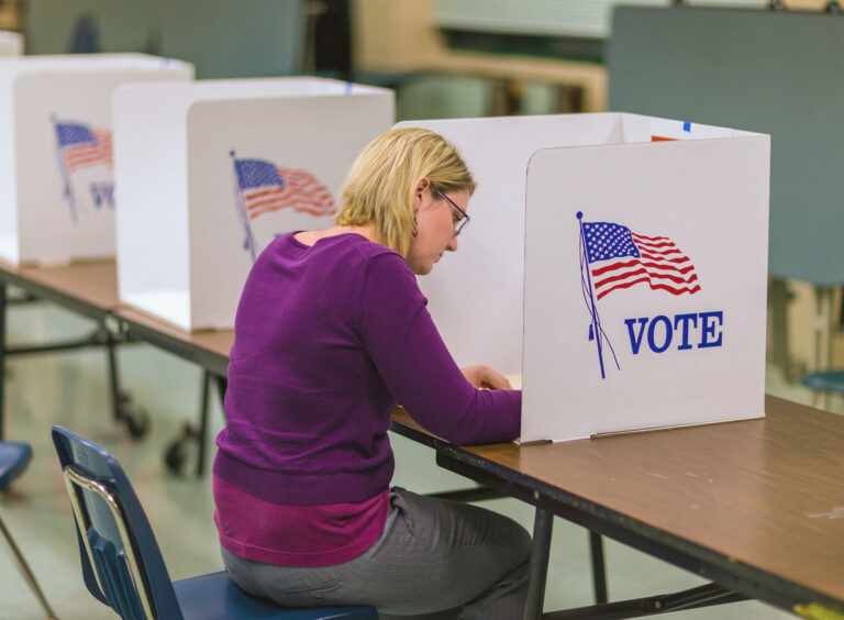
Enter your address to look up where you vote and what will be on your ballot.
At container widths above ~600 px, CSS Grid offsets the image leftward so it overhangs the content panel. No special modifier — Orchard does it via container query on .orchard-card-wrapper.
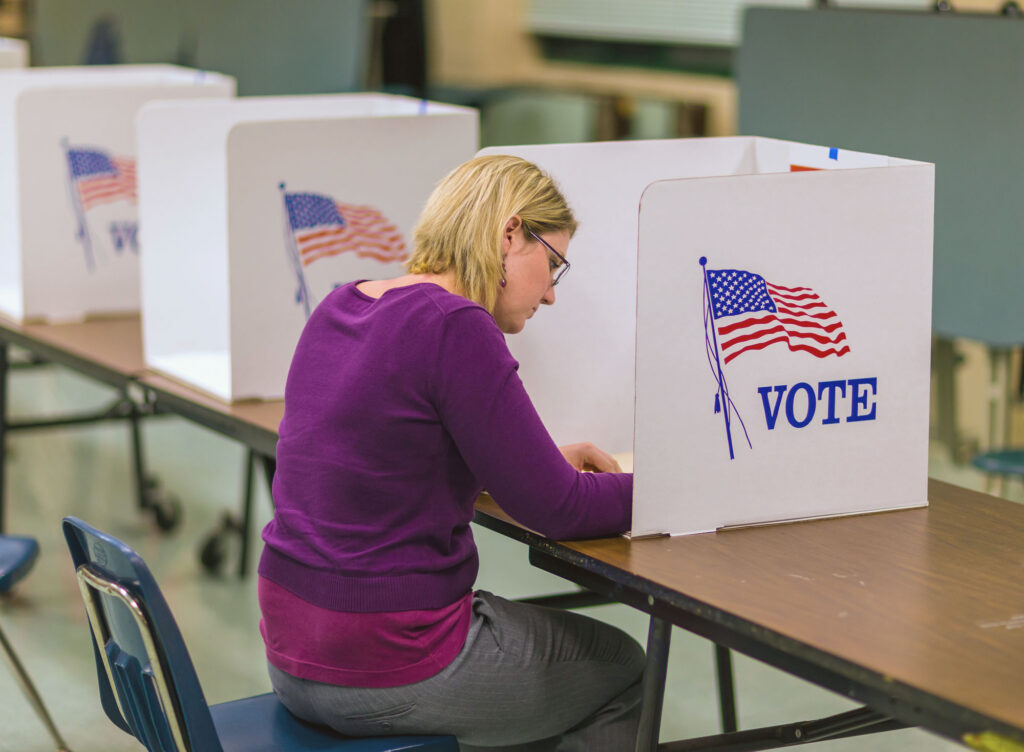
The deadline to register is 29 days before any election. Verify your status or update your address online.
A circular icon badge overhangs the top of the card. Icon color tracks the active palette automatically.
Thin separator + arrow link at the bottom. Use when the card is functioning as a teaser for a longer page.
Submit a public-records request under the Georgia Open Records Act. Most responses are returned within three business days.
Same card, link style set to inline — the link renders as a paragraph inside the body rather than a footer.
The Board meets monthly at the State Capitol. Agendas are posted seven days before each meeting.
The card stays white — the dark variant only swaps the top accent-line color so it stays visible on a dark surrounding band.
No card background — only the accent line + content typography. Useful inside colored bands where card chrome would feel redundant.
No white box — the surrounding background shows through.
The Card Grid block wraps multiple cards in a responsive column layout. Three columns at desktop, two at tablet, stacked on mobile.
Two columns, images attached. Each card’s “pop out” effect runs independently inside its own grid cell because the container query is scoped per card-wrapper.
Bare Orchard Card container (sg-georgiaseb/card-empty) — outer .orchard-card + an InnerBlocks content area. Drop any blocks inside. The single ACF field is the palette slug used for the top accent border; defaults to the standard card line color when left blank.
One card per column, each opening with an H2 and showing a different content recipe (paragraph / list / paragraph + CTA). Border color is set per-instance via the Top Border Color field.
Safeguard the integrity of Georgia elections through binding rule-making, transparent investigations, and independent oversight of every county elections board.
Public comment is open at every Board meeting. Sign up to address the Board, or submit written testimony any time.
A list of icon-link rows (sg-georgiaseb/icon-list). Each row is a title + icon + link. The block has a 1/2/3 column toggle (horizontal & vertical gap match); below 600px every variant collapses to a single column. Inherits Orchard’s .orchard-icon-link styling so the icon tile + label panel look identical to georgia.gov’s icon-link rows.
Outer 3-column block places three Card (Empty) blocks side by side. Each card holds an H2 heading and a single-column Icon List. Drop more rows into any list or bump the inner list’s column count to fill more space.
Two-image split hero (sg-georgiaseb/main-hero). A large Main image on one side, a smaller Secondary image (with overlay tint) on the other, and a content panel that bleeds across the seam. Falls back to a single-image hero with the panel below it on mobile. The content panel is InnerBlocks — drop any blocks inside.
Main image on the left; Secondary + panel on the right. Secondary image tinted with the Accent · Darkest palette slug at 80% opacity.
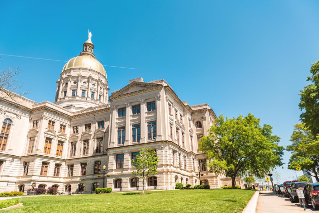
Your starting place for elections, integrity, and oversight in Georgia.
Same block with the Arrangement field set to main-right — Main image swaps to the right side, panel anchors to the left. Overlay set to Accent · Darker at 80%.
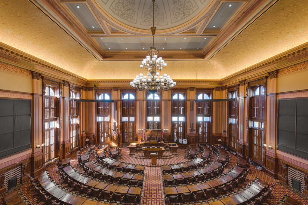
The Board meets monthly at the State Capitol. Agendas post seven days in advance.
Full-width image band (sg-georgiaseb/hero-center-aligned) with a constrained content panel hanging below the image edge. The panel uses the site’s default drop shadow and overhangs the image by a spacing preset; the section reserves the same amount of margin below the panel so the next block never collides with the overhang. The panel is InnerBlocks — defaults to a two-column layout (eyebrow + H1 on the left, paragraph on the right).
The default InnerBlocks template — a WP columns block, eyebrow + H1 in the first column, descriptive paragraph in the second.
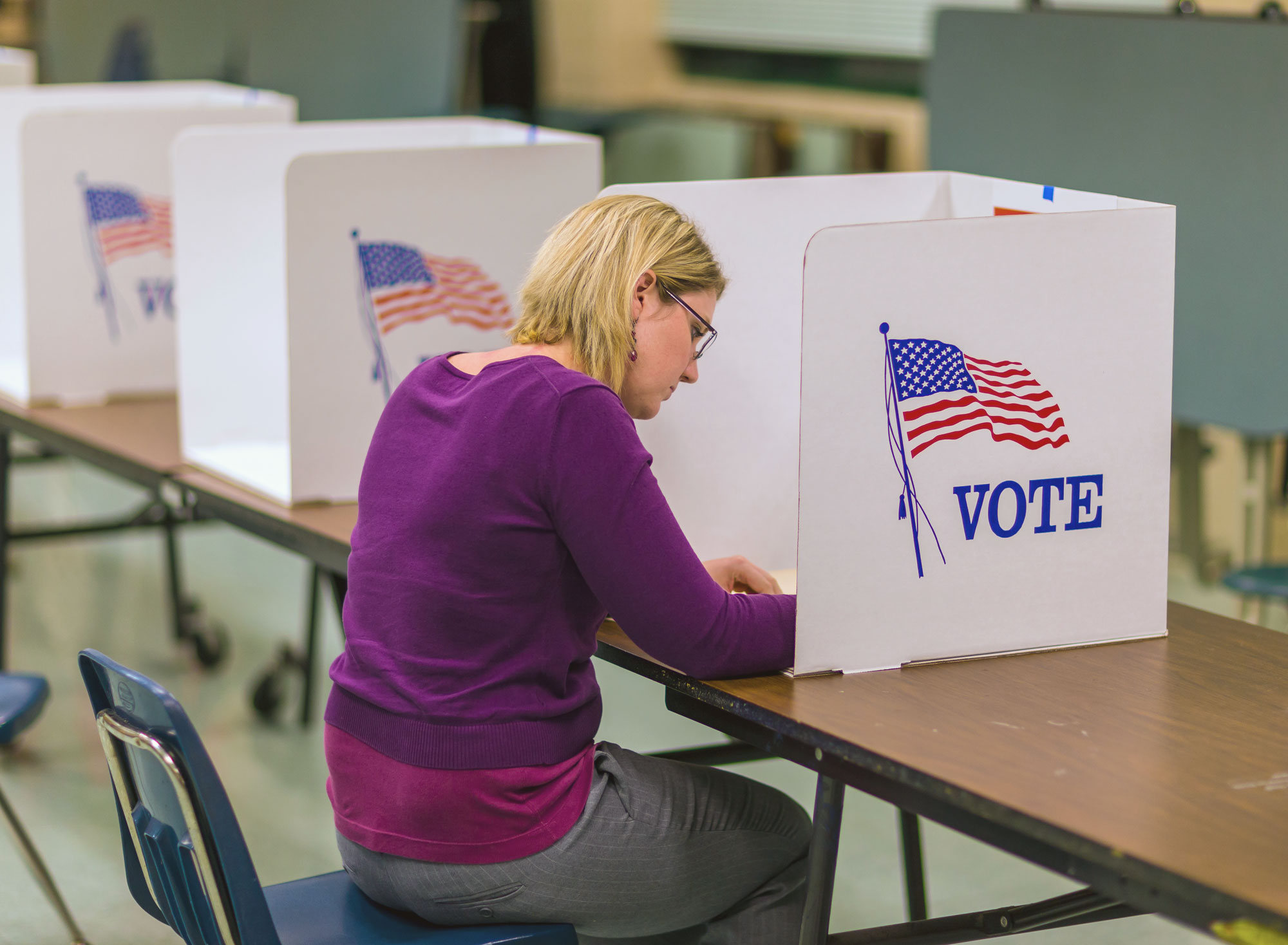
GUIDE
Registering with state agencies is just one part of establishing your business. You may have to interact with local governments and private vendors to set up your business. To help you navigate the process, key steps are outlined below.
Style variants registered against core/heading. Each appears in the editor sidebar under “Styles” and applies an is-style-<slug> class to the rendered heading.
Short accent rule above the heading text, in the same color the Orchard Card uses for its top accent border. Decorative width (5rem) is fixed; the gap below the rule uses a spacing preset.
Body copy beneath the heading shows the natural typography spacing. The rule sits above the heading text with the spacing-30 gap.
A grid of clickable tiles (sg-georgiaseb/tileset) — georgia.gov’s “Top Access Services” pattern. Each tile is a label + arrow with an optional photo above. Auto-fits to 3 or 4 columns and collapses to a single column at mobile widths.
The most common variant for primary navigation. Just label + arrow on the accent background.
Same tiles, denser layout — set columns to 4-up. Useful when you have eight or more tiles to surface.
Each tile gets a photo above the label with a subtle gradient overlay. Mix-and-match with text-only tiles in the same set if some tiles have representative images and others don’t.
Highlighted text block (sg-georgiaseb/callout). Two variants: Standard for emphasized notices, Quote for pull-quotes with decorative quote marks.
Left accent bar with serif body. Use to call attention to an important sentence or two without breaking the page rhythm.
The next regular meeting of the State Election Board will be held on June 11, 2026 at 10:00 a.m. in Room 341 of the State Capitol. Agendas are posted seven days before each meeting.
Top accent bar plus decorative open/close quote marks at the corners. The attribution field renders as a citation line underneath.
Election integrity is the heartbeat of freedom.
— Director Mills, State Election Board
Attribution is optional — leave it empty and only the quoted text renders.
The State Election Board operates independently of the Secretary of State and reports directly to the people of Georgia.
Section-level promo (sg-georgiaseb/promo) — same Orchard component as Hero, sized smaller (H2, large title) for use further down a page. Media slot accepts a YouTube URL (renders as an embedded video) or a standard image.
For the homepage’s “Watch the most recent meeting” slot. The video iframe replaces the image and the layout flows around it identically.
Most recent meeting
Watch on demand
The Board discussed proposed rule SEB-2026-04 (chain-of-custody for absentee envelopes) and heard public comment on three pending petitions. Full agenda and minutes are linked below.
Standard image promo, media on the right. Sized smaller than a hero — H2 + “large” title — to sit comfortably below the page H1.
Featured
The Board is accepting written comments on proposed rule SEB-2026-05 (county hand-count audits). Comments may be submitted by email or at the next public meeting.
Skip both video URL and image to get a centered title + body + CTA. Useful for a quiet section anchor between media-heavy blocks.
Open records
Most responses are returned within three business days
The Georgia Open Records Act gives the public the right to inspect or copy almost all records held by state agencies. Submit your request by email, web form, or letter.
Time-sensitive notice strip (sg-georgiaseb/alert). Three severity levels. Add a URL to make the whole alert clickable with a trailing arrow.
Next meeting: June 11, 2026
Agendas are posted seven days before each public meeting. Subscribe to bulletins for email reminders.
Public comment period closes June 30
Comments on proposed rule SEB-2026-05 (county hand-count audits) must be submitted by 5:00 p.m. ET.
May 14 meeting cancelled
Today’s scheduled meeting has been cancelled due to inclement weather. It will be rescheduled to a later date.
Standard interior-page title block (sg-georgiaseb/page-title-lockup) — eyebrow badge, sized heading with the colored accent rule above it, optional subtitle. Use at the top of every non-homepage page. This is the same lockup the Hero and Promo blocks compose internally, exposed as its own block for use without the image/CTA scaffold.
About
Five appointed members oversee election administration in Georgia.
Same lockup with the accent rule disabled — for pages where the rule conflicts with a banner image or background already in use.
Open records
Most responses are returned within three business days.
For a text-only landing page that doesn’t warrant the full Hero block.
Investigations, rulings, and public engagement.
Smallest preset, with H2 — for a major sub-section of a larger page.
Section